Making of Where the Shadow Fell
How Where the Shadow Fell was made, an atlas of 11,898 solar eclipses, and why almost everything good in it was thought up in response to a problem rather than planned in advance.
I had just finished another big pet project, football data portraits. It took a lot out of me, and I wasn’t going to start a new one.
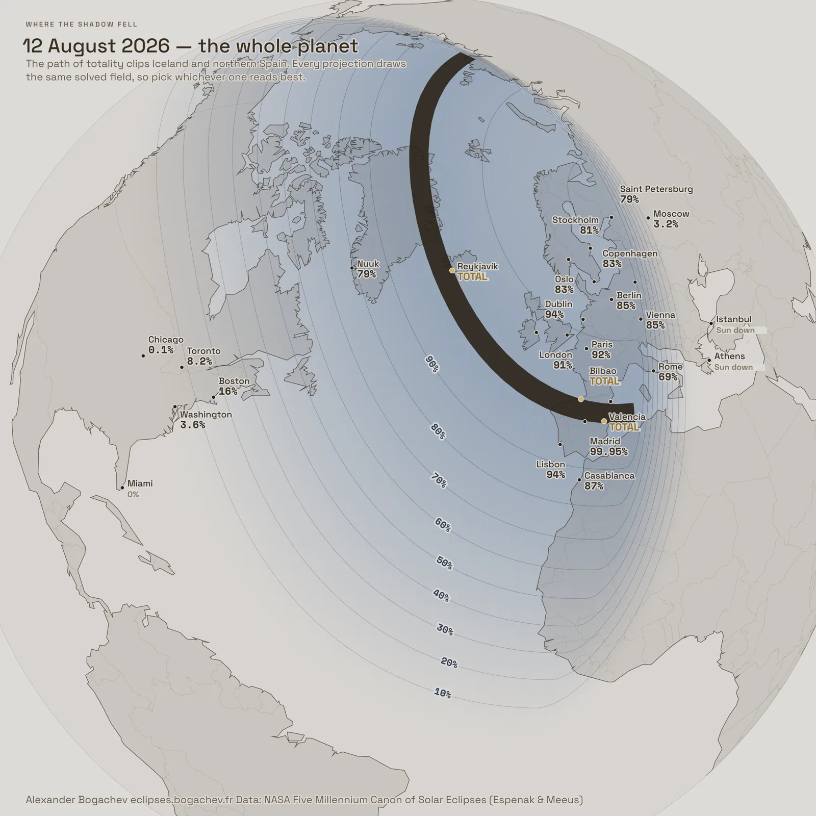
And then I happened to see a picture on Instagram. A map of France with little suns drawn on it, each one showing how much of it the Moon would cover on 12 August. First, that is how I found out there was a total eclipse coming. Second, I got curious right away: when is the next one? when was the last one? And not only in France, in other cities too.
I looked for a service that shows this. Didn’t find one straight away. So I decided to make it myself.
That was 19 July 2026. The day numbers in the captions below are counted from it. Twenty-six of them in the end.
It was meant to be something fairly simple. But it started growing fast, and the project took me over completely.
The main thing I took away from it
A lot of good decisions don’t get thought up in advance. They show up in response to a problem.
If you are making something and the project has started to come together, and then you hit a wall, don’t abandon that spot and don’t go around it. Keep picking at it. Very often what comes out is a nicer answer than the one you were looking for at the start. Almost everything I’m happy with in this work arrived that way.
What this is, in one paragraph
The NASA catalogue Five Millennium Canon of Solar Eclipses lists every solar eclipse from 2000 BC to 3000 AD. Eleven thousand eight hundred and ninety-eight of them. The atlas takes that catalogue whole, and everything else on screen it computes itself, from what are called Besselian elements. That is a short table of numbers published for every eclipse: where the Moon’s shadow sits at any given moment relative to the centre of the Earth. Knowing it, you can derive how the eclipse looked from any point on the surface. The tooltip, the city card, the path edges, the isolines and the fill are all computed by the same function, so they cannot disagree about a single eclipse.
I am leaving out an enormous amount of scientific cross-checking here. A few of the most important numbers I will still name at the end.
Part one: what it looked like at first
I found the NASA dataset fairly quickly. It holds the peak position of every eclipse, and the first thing I made was a globe with little circles hanging around it.
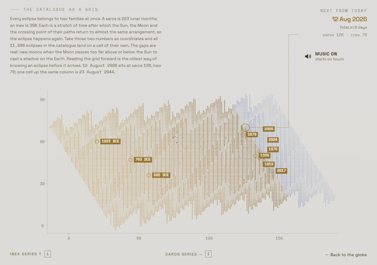
Then I went off to look at references, who had done what on the subject of eclipses. And I found an absolutely stunning table of cycles, saros and inex. I wanted it in the project straight away.
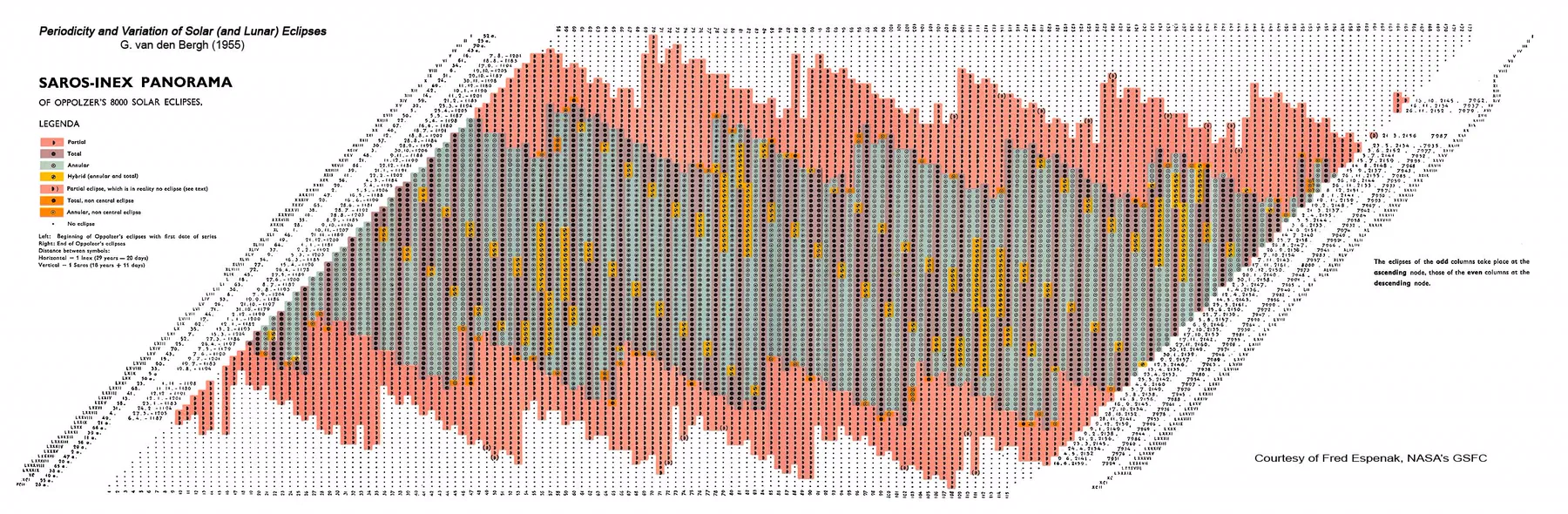
That is what the project was at first. Eclipse dots on a globe, the globe spins, a filter by year. Buttons up top to switch between the globe and the saros–inex lattice, and they flew into each other nicely. All on a dark background.
Sadly, not a single screenshot of that stage survived. Git only turned up in the project on day six, by which point the dark era was over.
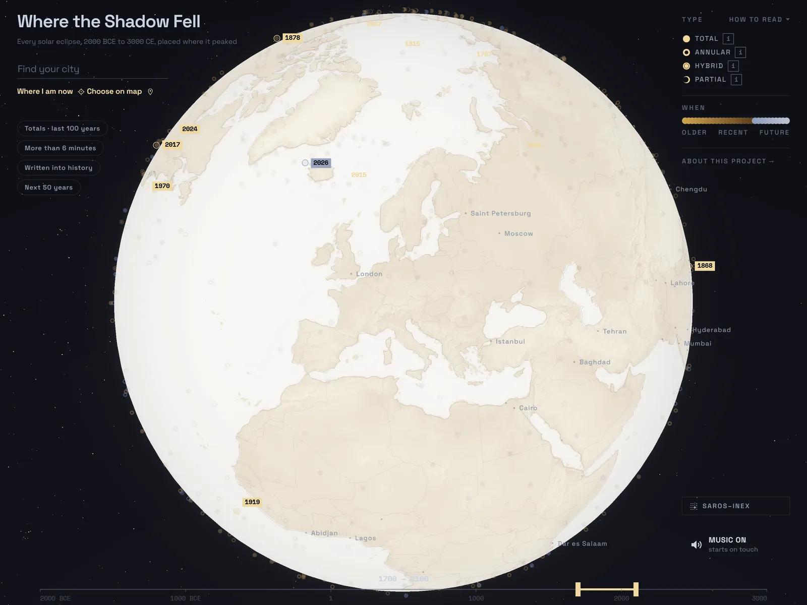
Then I turned all of it around. Darkness stopped being the resting state. Darkness is what an eclipse does, and rest is an ordinary bright day. I lost on the drama of the opening. What I got instead was a new dimension: an immersion for the reader, if he ever gets down to that layer.
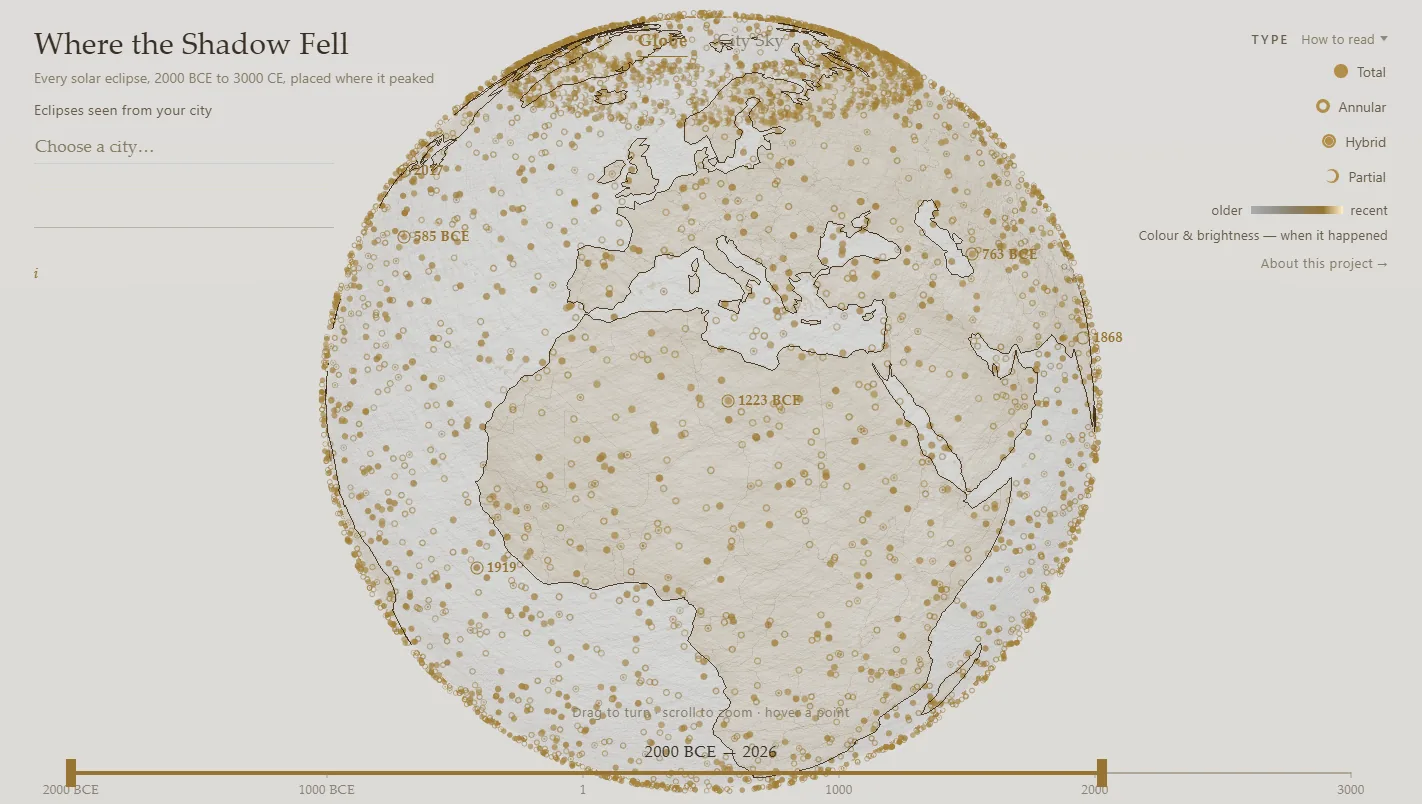
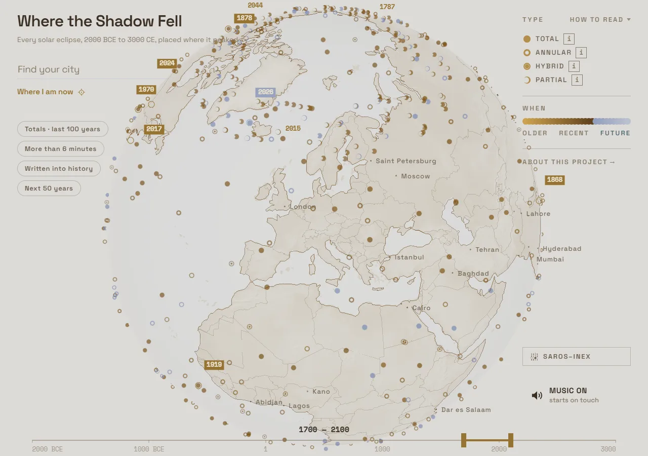
The July frame already holds the whole catalogue, but it has no way of letting you in. By 7 August there are four ready-made questions under the search box, the scale has a cold FUTURE end, cities are labelled right on the sphere, and there is a SAROS–INEX door in the corner.
The intro was there almost from the start
I wanted the intro to be striking enough and at the same time to explain what the project was about. Without words.
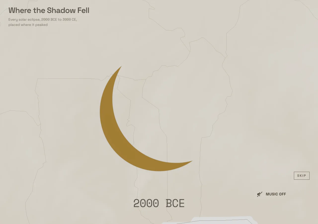
The idea from the very beginning was this: we zoom in on the first known eclipse, show its mechanics, label which eclipse it is, and then fast-forward through all the rest. The first known one is 12 June 1999 BC.
But there was no shadow in it back then. A little ball just moved.
Then I saw photographs of the shadow taken from space, and made a shadow drift under the ball. And then I wanted to rhyme in the shadow that had already passed. Not a trail in the literal sense; a way to see where the shadow had gone, because normally the Moon’s shadow does not hit the Earth at all.
The commit history says all of that happened in one day, 28 July, in three edits in a row. The intro itself took far longer to make. Over eleven days 43 commits touch it, and there were fifteen or twenty iterations, I think, before I got a result I was fine with. I was tuning the speed of the cascade, the moment the ground arrives, the pause at year zero, the timings on a phone. In its first second the cascade used to open with five hundred and five shadows. Now it opens with nineteen.
Nobody designed the trail. It appeared because without it the previous frame didn’t answer the question.
Part two: the sky over one particular city
The project was already decent, in principle. The real turning point was something else.
I realised it would be great to look at the sky over one particular city and see which eclipses had been there and when. The thought simply floored me. It came about five to seven days after I started. I thought of it at night, before sleep, which is generally when project ideas come to me best.
Then I started trying to build it, and for a very, very long time nothing worked.
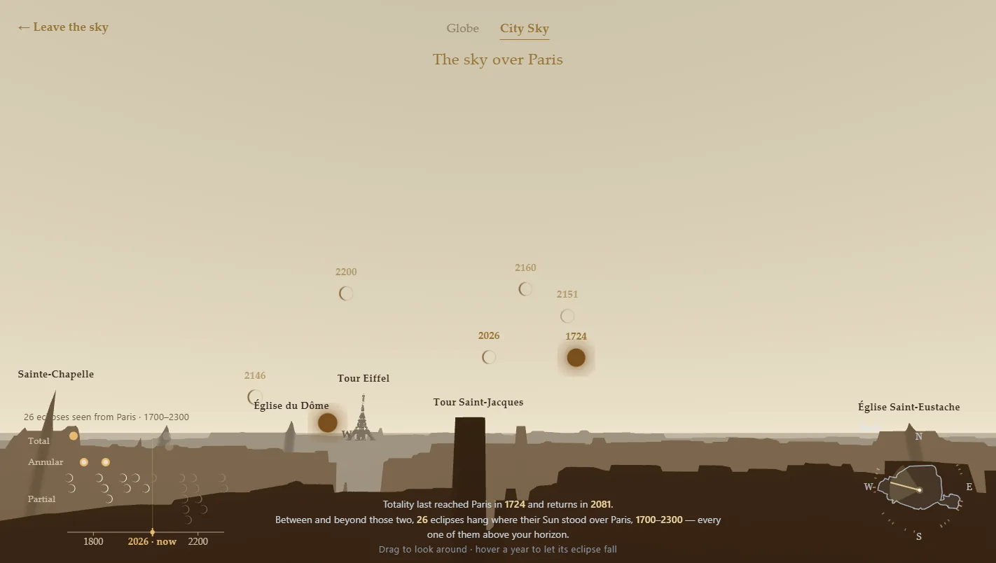
The sky and the Sun turned out to be the easy part. Where the Sun is in the sky for a given place and a given instant was written on the very first day and never opened again. The horizon was solved in one evening.
And then there were the buildings.
Twelve approaches, five days
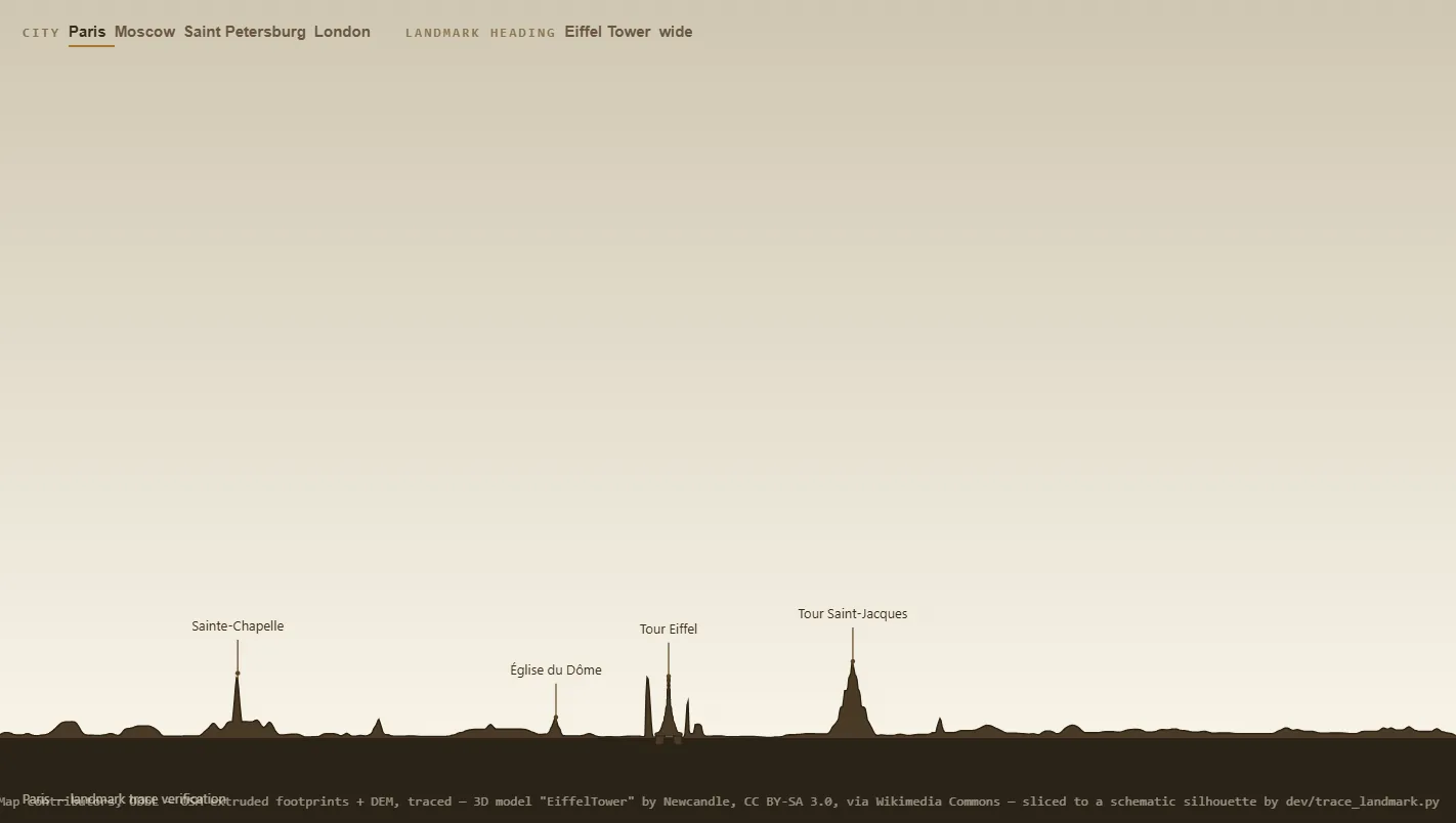
OpenStreetMap gives you a building footprint and a height tag. Extrude one by the other and you get a box. This is a ceiling in the data, not a failure of drawing: a landmark nobody has broken into parts becomes a box, and the Eiffel Tower becomes a solid slab.
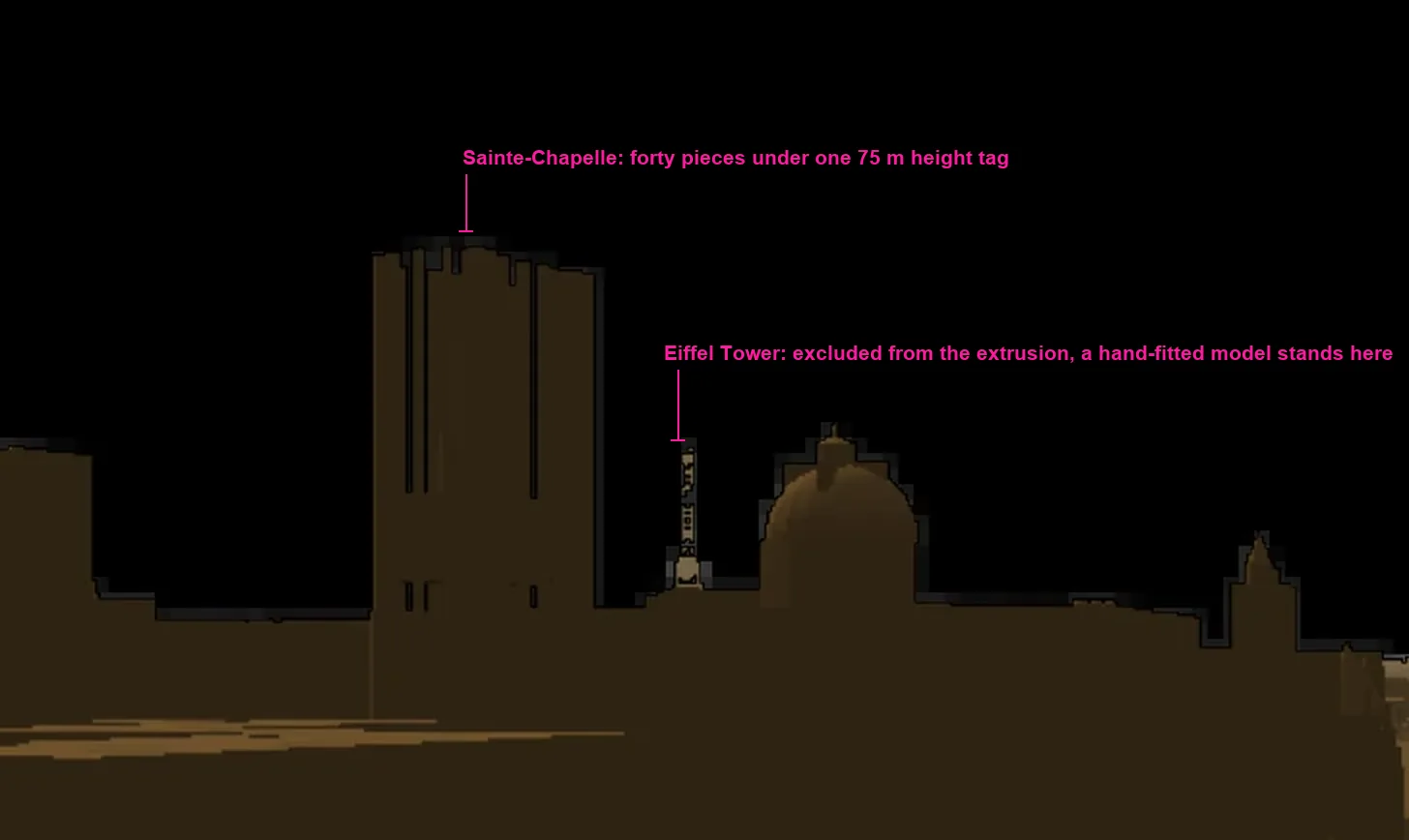
I ran series of deep research passes in different neural networks and tried approach after approach. Here is the whole list. Three of the twelve died on paper and never reached code at all.
| # | Approach | Fate |
|---|---|---|
| A1 | Real OpenStreetMap buildings, extruded by height, in a 3D scene of my own | Paris alone: 6.66 MB of data, ~1.1 million triangles. Dead as a live scene, survived as an offline tool |
| A2 | A circular 360° profile of the horizon silhouette | Still shipping, as a fallback |
| A3 | A separate 3D model for each landmark | Looked for 18 across Sketchfab, 3DMR, Europeana and Open Heritage 3D. Not one clean on licence and reachable without a login |
| A4 | Bake a panorama of the 3D scene, once, offline | Two days. 10,080 × 1,960 pixels. Photographing a crude city at high resolution gives you a crisp record of a crude city |
| A5 | 360° photo panoramas in sepia | Died at once against three walls |
| A6 | Photo cut-outs at their true bearing and height | Lives behind a flag in the address bar, for exactly one object: Notre-Dame from a Panoramax capture |
| A7 | A vector trace of the profile | Picked as the lead direction, and doubted the same day |
| A8 | Landmark silhouettes traced by hand | Gone. One artefact left: 83 points placed by hand for a single building |
| A9 | Parametric archetypes at real dimensions | Killed twice without a line of code written |
| A10 | An off-the-shelf tool or dataset of silhouettes | The review ended with a conclusion: there are two mature worlds, and nobody connects them |
| A11 | Overture Maps instead of OpenStreetMap | A consistent negative result |
| A12 | A flat horizon with callouts to the landmarks | Solves recognisability by deleting the subject |
Three walls killed the photographic route at once. The automatic selections were bad. Coverage was not there where it was needed: Panoramax gave eleven captures at the Paris point, one in London and zero on Red Square. All of Moscow is on Yandex, but its terms forbid saving and modifying anything obtained through their panoramas. That left Panoramax and Mapillary as the legal ones, both CC BY-SA, which means a cut-out drags the licence and the photographer’s name along with it wherever it goes.
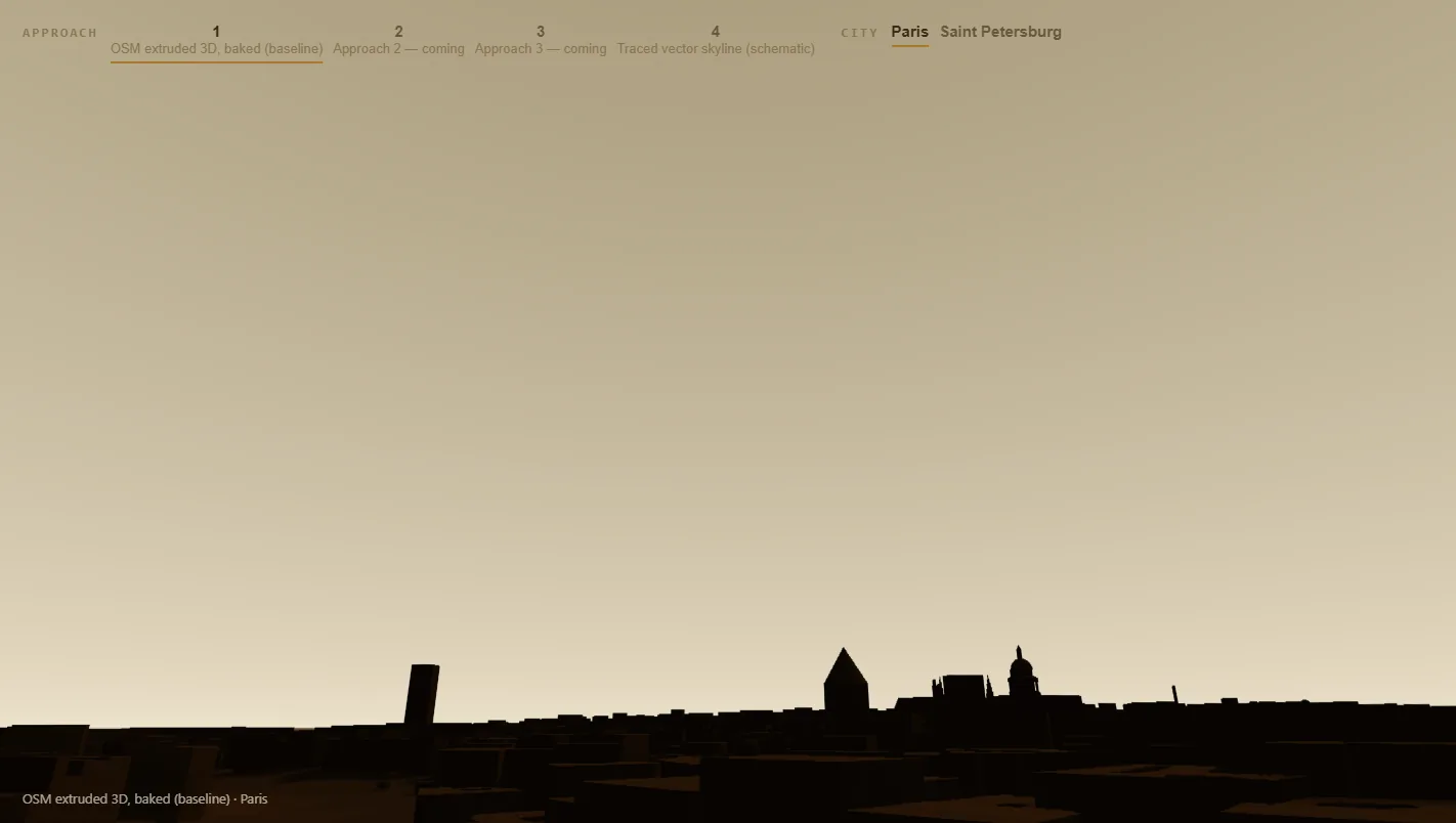
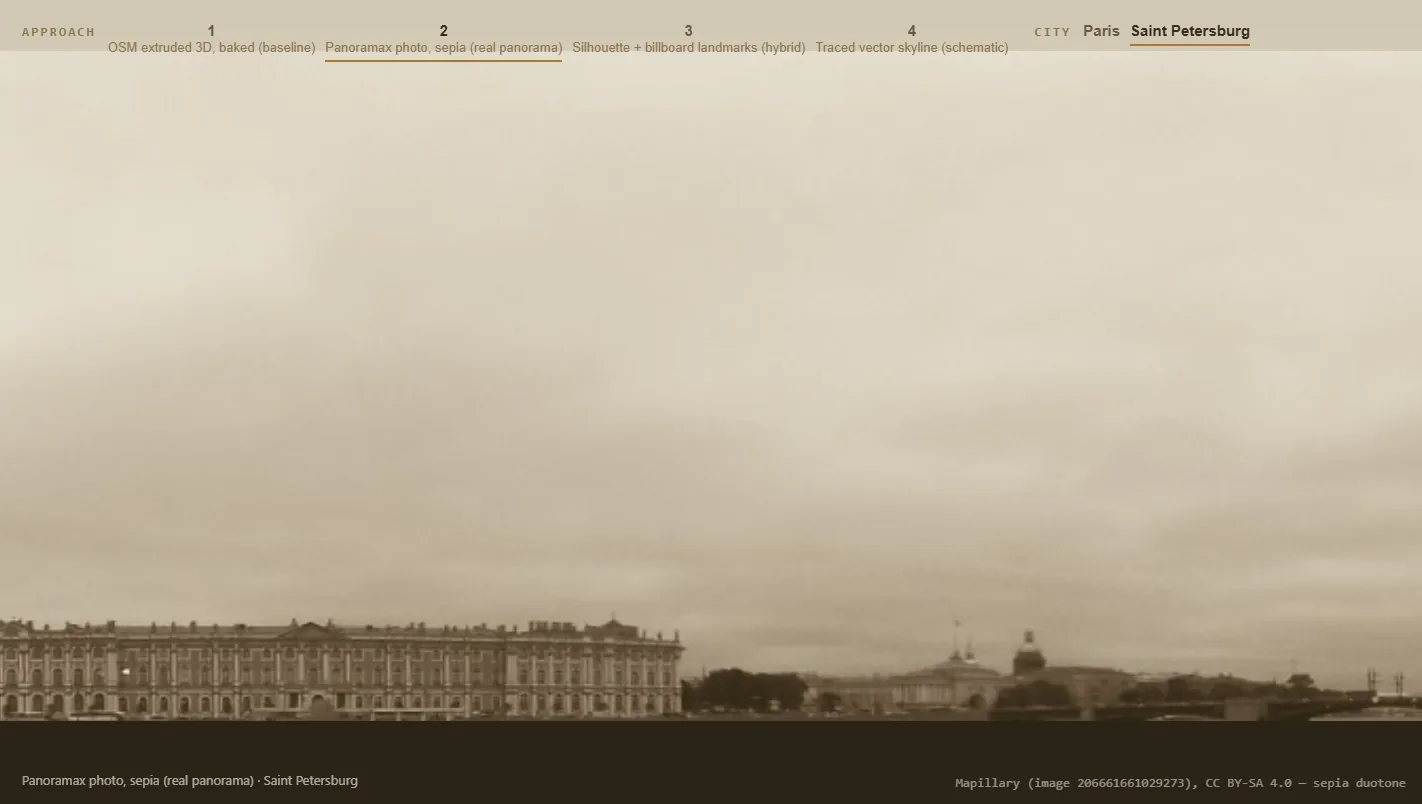
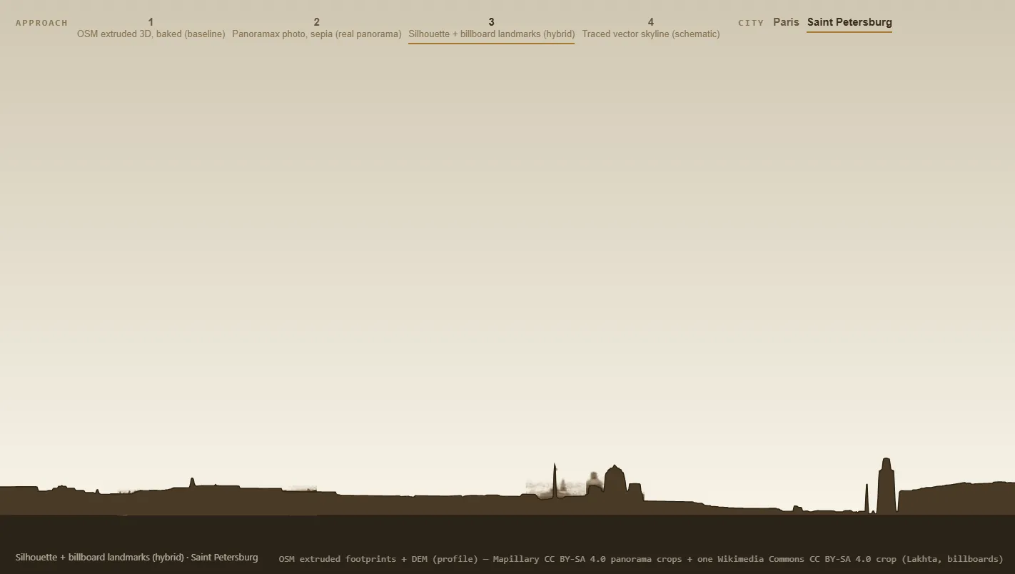
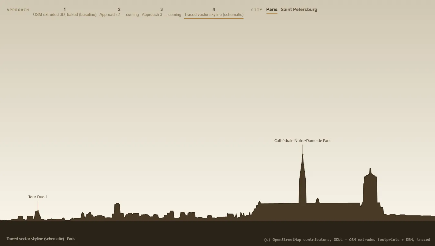
On 26 July a comparison page drew the same city four ways. The third frame shows how badly it traced. It could have been improved. But it was already clear the approach wasn’t viable, and telling those two apart is exactly what I spent those five days learning. A difficulty gives way if you give it more hours. A ceiling doesn’t. Twelve approaches fit into five days because each one was stopped where the ceiling showed.
The height tags, meanwhile, are worse than you would guess. The Burj Khalifa came out as a twelve-metre stump: the builder had a 400-metre cap per building part left over from the Paris weeks, and the real 828 metres fell through to the default. And for one day the London silhouette was labelled MR PORTER Steakhouse, Bar & Lounge London, because a hundred-metre building on Park Lane turned out to carry a restaurant tag.
All of this was found by eye, from the picture.
The A10 review ended with a conclusion I would hand to anyone starting something like this: there are mountain tools that know terrain and know nothing about buildings, and there are 3D city renderers that know buildings and never reduce a city to a horizon line. Nobody connects those two worlds. And any global building dataset, Google or Overture alike, is boxes again.
Where to stand in the first place
Everything above assumes the viewer is standing somewhere. Putting him somewhere turned out to be the deepest question in that whole screen.
The height of the Paris eye, in the order it was set: 30.4 m, 42, 30, 24.7, 24.0, 23.6, 33.2 and finally 23.2. Eight answers in four days to one question about one city.
First there was a rule about a percentile of roof heights. It was raised by hand, because at thirty metres Sacré-Cœur hides behind the Centre Pompidou, then capped, because at sixty the frame goes flat and empty. In the end the height is decided like this: look for the one where half the everyday city is above your horizon and half below it. You stand at the height of an ordinary neighbouring roof.


I liked the move with depth in three layers. Getting it all the way to what I wanted, with recognisable tall landmarks, never worked out.
I also ran a separate piece of research on viewpoints: where to stand in Paris, in Barcelona, in Rome so that the city is visible. In Barcelona both famous spots fail, they are a “sea of roofs from above”, and the one that works is an embankment nobody has heard of. In Rome the textbook Janiculum fails.
Originally I had no idea of letting you stand at any point in the city. I wanted to pick the viewpoints by hand for every city that would be in the project.
And then, again before sleep, it hit me that you can simply let a person stand anywhere. And all that work became unnecessary.
And then a colleague said one word
I had been stuck on the city for about four days. I had completely despaired and thought nothing would come of it.
I complained to a colleague, and he asked: why don’t you take Mapbox?
I was floored. I use Mapbox in projects all the time. Here, for some reason, it never occurred to me. Probably because it costs money and it is a bit slow, a bit heavy for computers.
And I understood immediately that it could work. Because it is the only one with a layer of buildings drawn in detail across the whole globe. And tall landmarks were exactly what I needed.
The winning prototype stood up on 27 July at 23:27. The architecture of the finished work was settled at 01:15. One hour and forty-seven minutes.
And here is the funniest part: not one deep research pass from any neural network suggested it. A search for the word Mapbox across every research document in the project finds nothing. The overnight research weighed OpenStreetMap, Overture, city 3D models, Panoramax, Mapillary, photogrammetry and parametric archetypes, and ended with a formal recommendation. It never once named the thing that won. The colleague named it, in one sentence, in reply to a complaint.
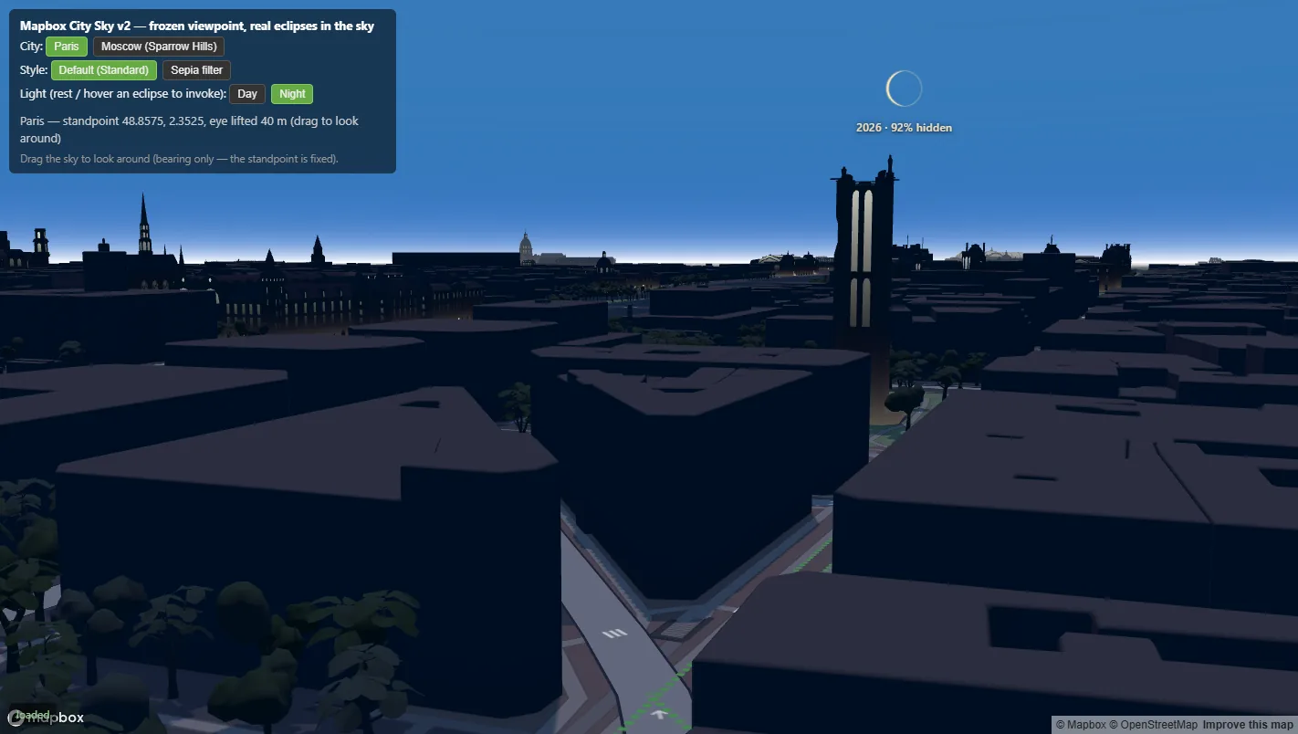
The style had to be made by hand
Some time went into picking the style, of course. It was fairly hard, and there were a lot of iterations here. In the end I could not get the result I wanted in code at all, and the style had to be made by hand, in Mapbox Studio.
The first version was thrown out the same day. The prototype laid a two-colour wash over the whole screen, over the default map view. A wash is a filter on top of somebody else’s picture, and a style is the picture: the Seine came through the filter as a pale blue-green band from somebody else’s palette.
The blue was eventually rhymed with the future. Cold ink everywhere else in the work means an eclipse that has not happened yet, and the blue on the map was tuned to that same blue.
The price for it was a live dependency on a commercial service. That is why the whole pre-Mapbox silhouette engine still ships as a fallback: City Sky drops to it if the library did not arrive or the key was rejected. It is a weak option, I know that, and I have not got round to strengthening it yet.
New York, where the mode got its ethics
After Mapbox I started going through the view in each city one by one, and I rejected New York. The skyscrapers close over the standing point and take the sky away.
Until then the standing point was simply the centre of the city, and the centre of New York is Lower Manhattan, where 59% of the horizon is built up above 30°, and in Tokyo it is a full 100. The sky is the subject of this screen, and there was no sky.
The solver’s first answer put the reader on the Brooklyn Heights Promenade, and by every number it was a triumph. The frame came back with an empty horizon. Manhattan was behind the camera. The screen arrives aimed at the eclipse, and the eclipse was standing in the other direction. Which means the question “is there a city there” has to be measured only over the part of the horizon where the Sun can stand at all.
That viewpoint research I had done by hand and which had become unnecessary came back a week later in a different form: a program computed standing points for 107 cities, and each one has a confidence recorded with it.
And the newest thing in that whole screen is the ground. Until the last week City Sky stood buildings on a flat plane. In Paris that costs almost nothing, which is why nobody noticed. In a city with hills under it the horizon was simply wrong, and the horizon is the entire subject of this screen. Terrain is on now, in every city, at true scale.
Part three: everything looked the same
This is the second big example of what I was talking about at the start.
On the globe every eclipse was drawn the same way. A heap. No front, no back, and nowhere for the eye to go.
The first answer was “where to look at all”. Cities got their names right on the sphere, and presets appeared under the search box, each one gathering a set of eclipses worth looking at. When everything carries equal weight, the question “where do I look” has no answer at all.
The second answer was opacity, handed over to age. The heap got a front and a back: the paler it is, the further away in time. It is a very simple move, and one of the ones I am happiest with. The future also got its own paint, a cold one, where before it had been the same colour as the past.
And then the partial eclipses surfaced.
A partial eclipse has no shadow
A partial eclipse lays no shadow on the ground. There is no shadow, there is nothing to draw, and a drawn shadow would be a false statement. I will honestly admit I understood this only after I had drawn it.
On the city layer it is subtler still. When you pick a city, the work draws the corridors of every eclipse that city has seen. For most of them the shadow fell somewhere else. Saint Petersburg has twenty-two corridors in its window, fourteen total, six annular, two hybrid, and the city stood under none of them. Nothing in the picture said so.
Opacity was already spent: it meant age. The second problem could not reuse the first problem’s solution, and it was that ban that forced a pattern to be invented. If opacity had been free I would have taken it, and the result would have been worse.
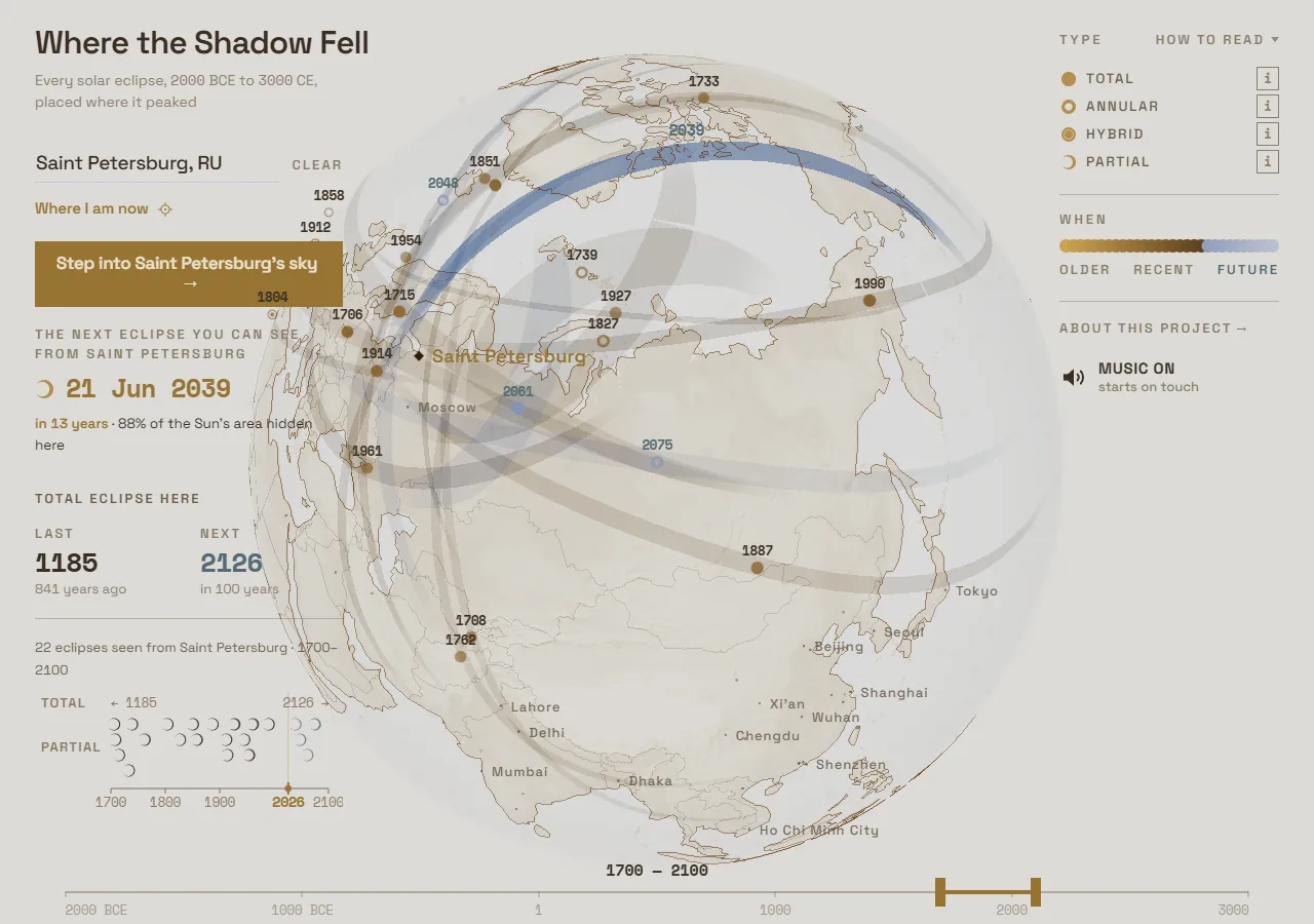
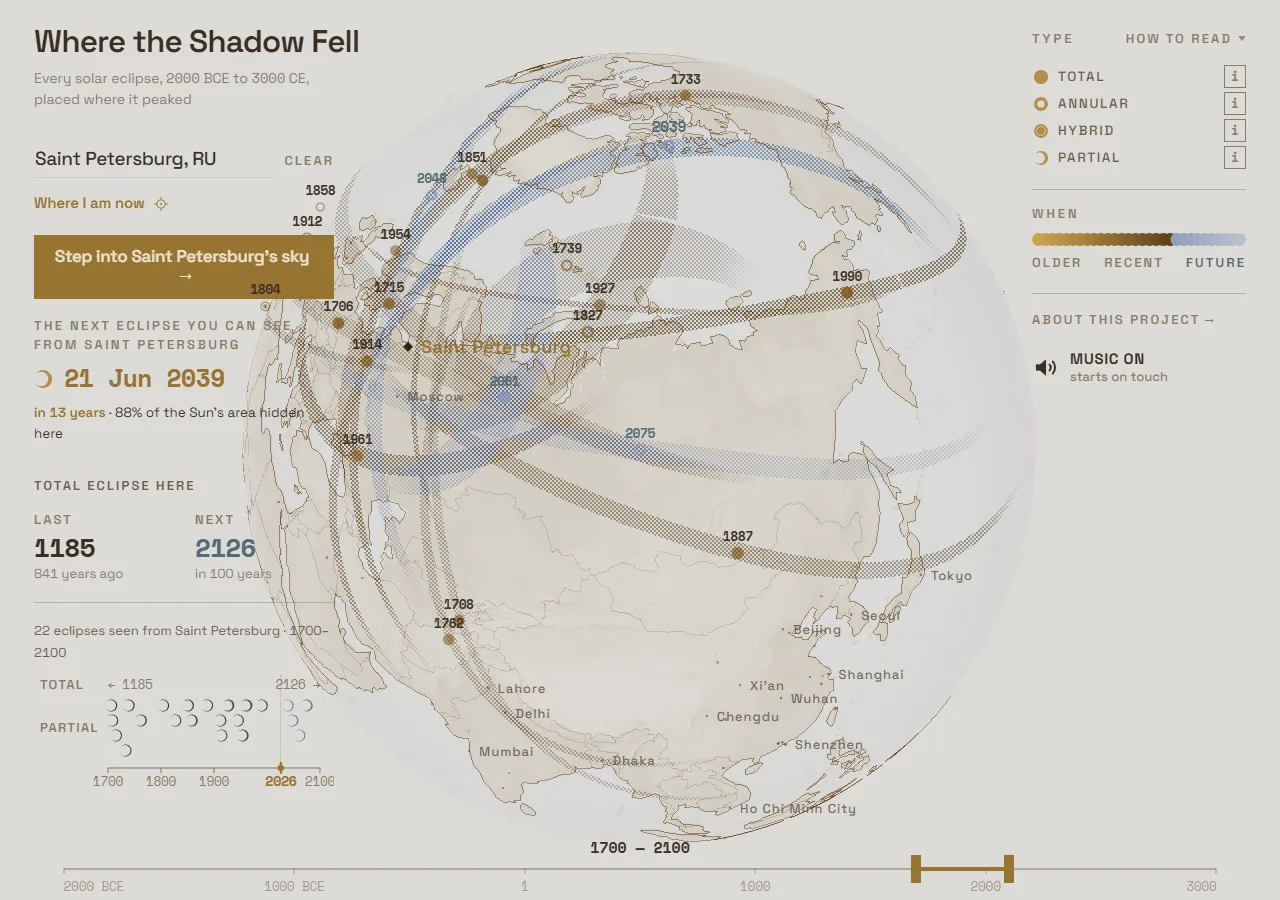
And there were a lot of variants
The marker for partials swung five times in thirty-one hours, on 2 and 3 August.
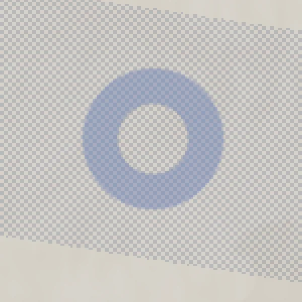
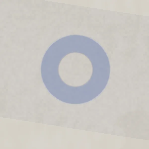
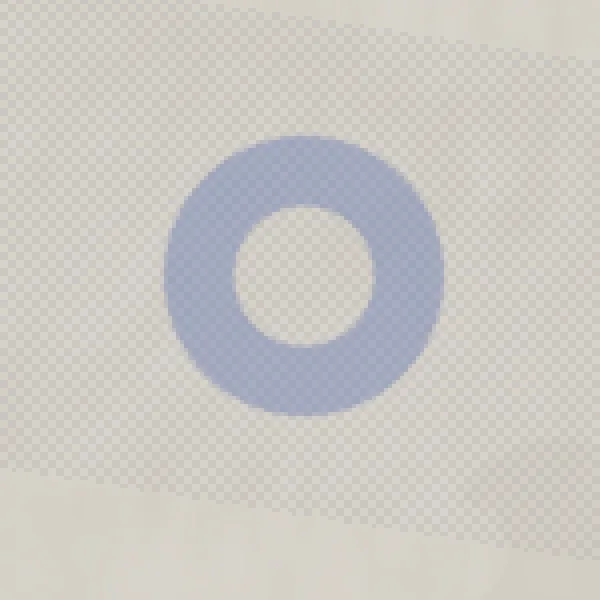
First a checkerboard grid at full ink. The darkest pixel of a partial came level with a total, and it read like the transparency checkerboard in a photo editor.
Then dithering, in which density also carried the amount of coverage. It lived for nineteen minutes. Out of it came a rule: the pattern says what kind of shadow it was, and the weight says how important it was. A pattern that also changes is a pattern the eye is obliged to read, and reading is attention, which a partial eclipse has not earned.
Then the same checker, muted.
Then continuous grain. It was built to fix the checker’s main physical untruth: inside the penumbra the light is dimmed everywhere, it does not alternate. The grain was truer. And it did not read: the mean brightness of the checker and of the grain is the same, while the grain’s darkest pixel is a third lower and its local contrast three times lower. That is exactly what a person means when he says “washed out”, and exactly what an average does not see.
In the end the work knowingly chose the physically cruder marker, because the truer one did not
read. The final move was not design at all. It was git log -p, read backwards to the first commit
that ever put a pattern on a partial, and the shape restored from there word for word. The request
had been the same one all along: mute it, keep the marker.

Part four: the interface that suddenly went simple
Everything fell into place, everything started working naturally. And the interface would not come together.
I had the saros–inex mode. I had the sky over a city. Make three tabs? Interface problems started. In the end two tabs were left. In the end I removed saros–inex altogether, though my heart was still with it.
And the little panel on the left still refused to come together.
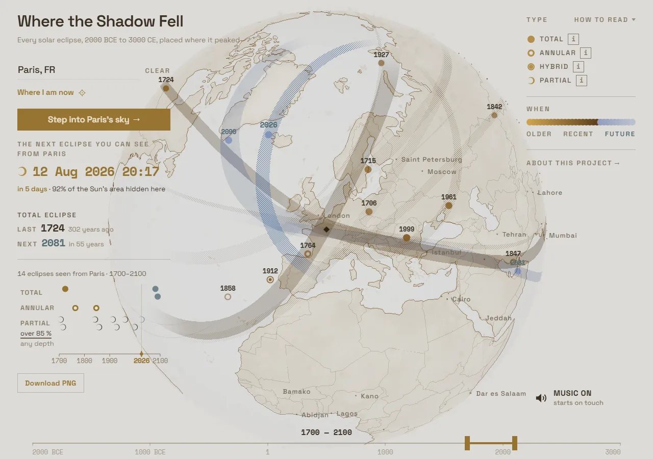
And then at some point it all turned out to be very simple. I removed modes of any kind. A search field was left. You go into a city, the city card opens, and in it you can press “enter the sky over this city”. That is all.
It simplified the interface radically, made it clean and clear. It was a small victory. And that was the moment I understood the project was coming together and that it would work out.
Not when Mapbox showed up. At that point I only understood that I now had something to draw the city with. That the work would come off, I understood when I took three buttons out of it.
Part five: the small decisions that are the work
The card you can download
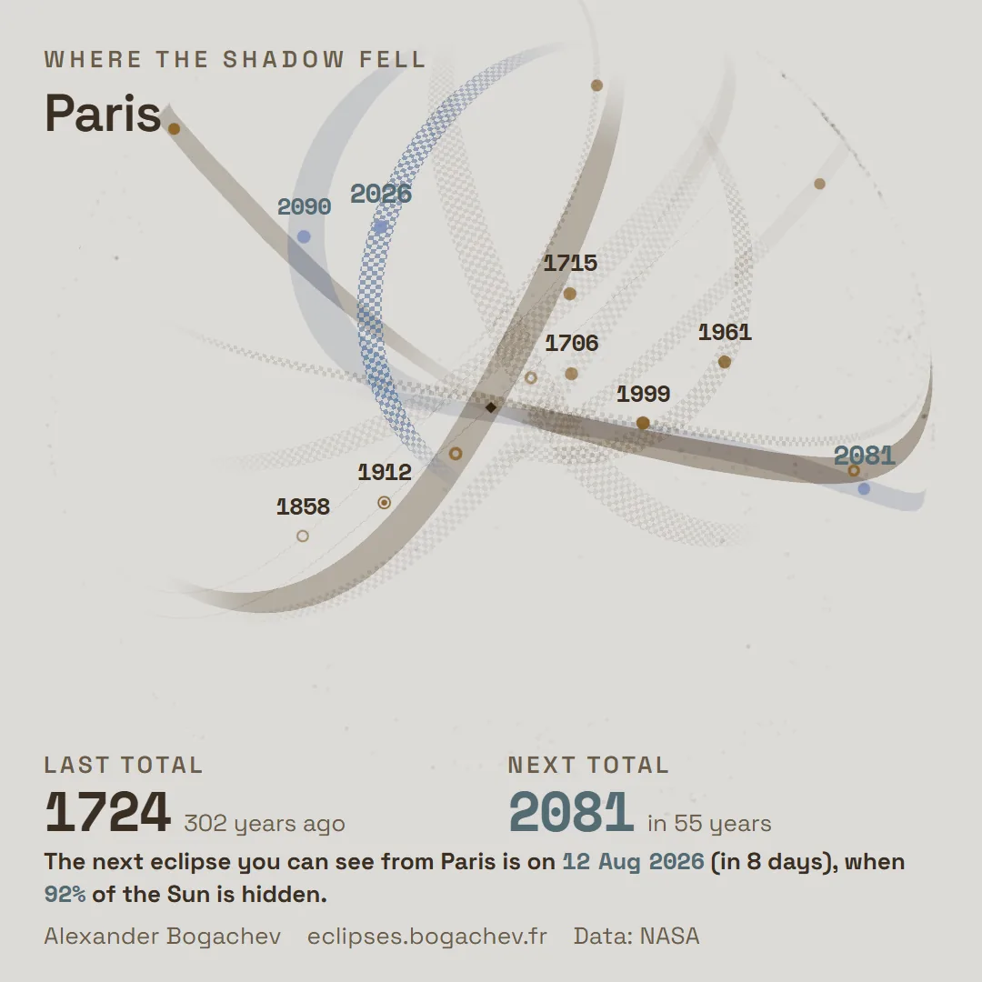
I worked for quite a while on the city card the reader can download. The idea took hold of me, it seemed to me it would be a great artefact.
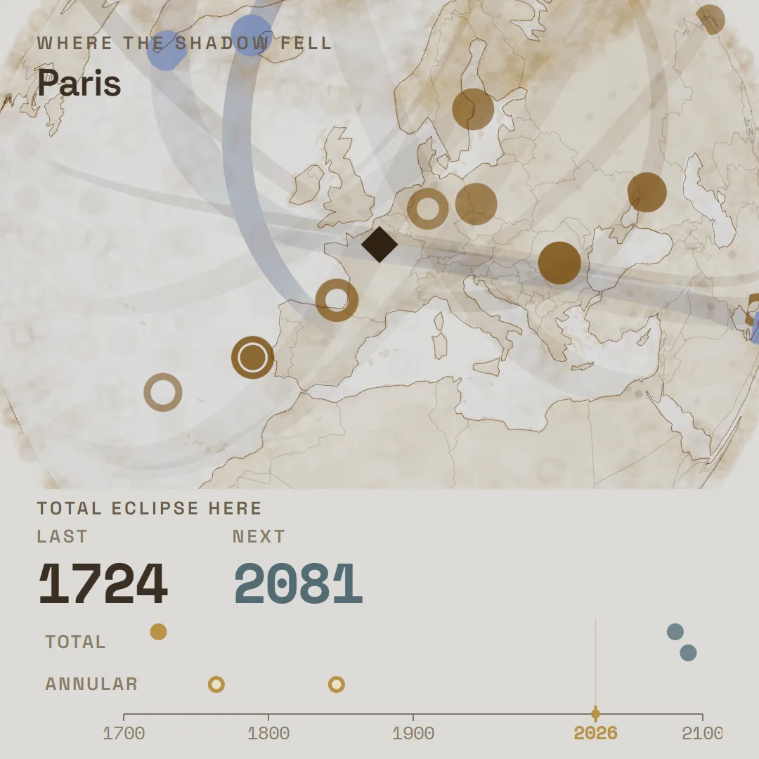
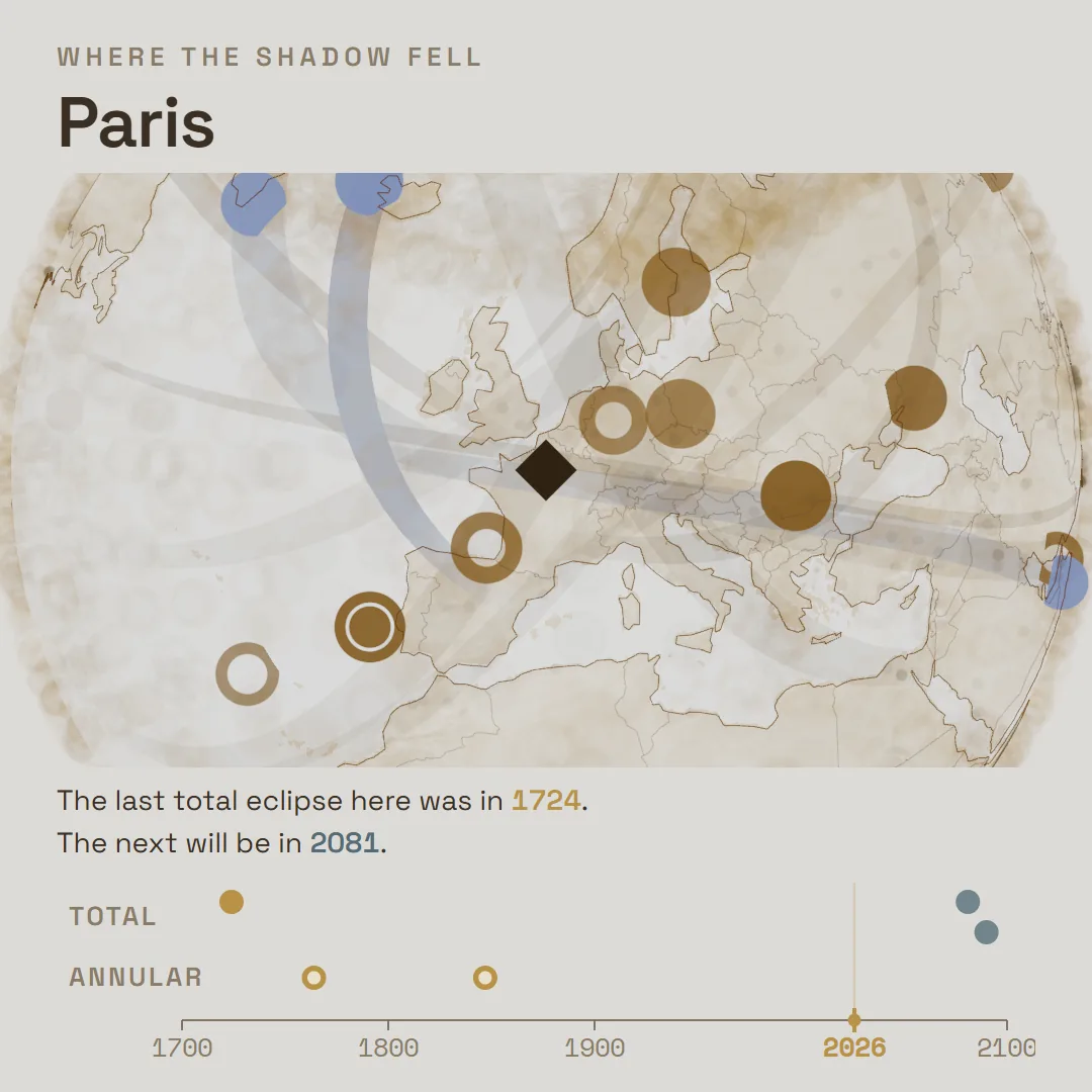
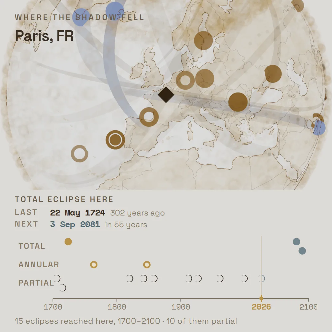
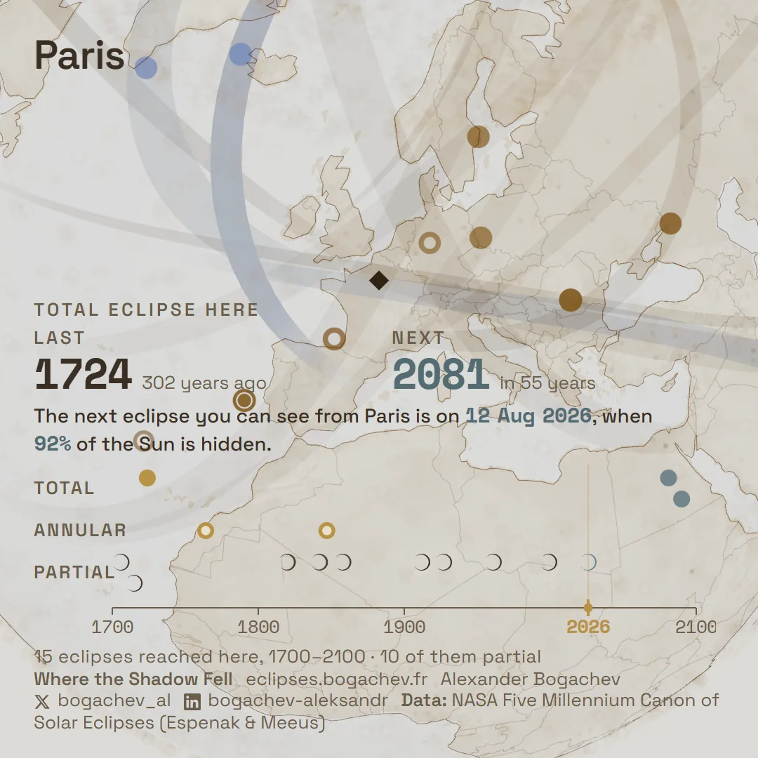
Paris in all of them, 1080 × 1080, from the same computation; what differs is how much of the card is given to the globe: in d the globe is the whole card, in a 64%, in c 57%, in b 54%.
There was also an idea for a data-art card with nothing on it. Only lines and the name of the city. The way I remember it, I never took it to the end, because of a mass of other tasks. In fact it shipped: a fifth layout, without a single line of type, went to production on 4 August and is still the one that downloads.
The halo
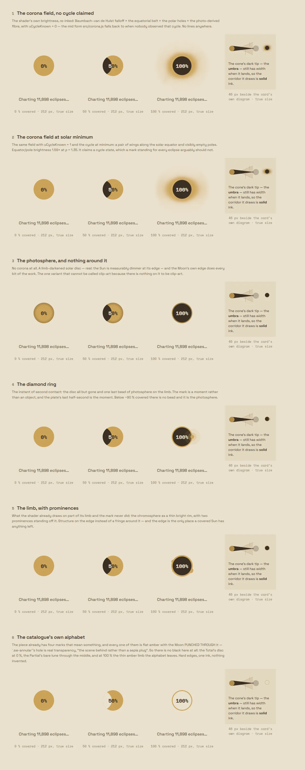
I am particularly fond of the moment when the mechanic of the eclipse itself got figured out. You hold the mouse on an eclipse, the Moon covers the Sun, a halo appears.
I did a lot of research on what the halo looks like. The mechanics varied, some of it looked good, some of it not so much. In the end I think I managed to build it reasonably well.
And I very much wanted to get across that it goes dark during totality. So in the total phase the colour inverts.
Colour that already means something
Warm is the past, cold is the future, gold is the warm end of the scale. So when the nearest eclipse was highlighted in gold, the work said in its own language that the one eclipse that has not happened yet had already happened. Highlighting now uses what does not mean anything yet: a flash, size and light. There are no rounded corners and no outlines anywhere in the work, and no small type either: 13 pixels is the floor.
Part six: making it not lag
At some point everything started working. And then a friend wrote to me: the project is beautiful, but it all lags. Everything stutters for him on a relatively recent MacBook.
That is when I got serious about performance.
What was wrong, briefly. One helper grid was eating up to 89% of every frame on desktop, and entering City Sky blocked the main thread for almost thirteen seconds. The grid was taken out of the frame, the city started arriving in pieces, the map script stopped blocking rendering. The first thing on screen now appears after a second instead of almost four.
Then I was facing a fork. Either the person waits a long time while the map loads, and in exchange everything inside is smooth afterwards and nothing lags. Or it loads at once and can move in jerks.
After a certain amount of thinking I decided to do the full load, so that inside everything would already be smooth.
A very large amount of time went into fine-tuning the interface on a mobile phone. It is not a story, it is the background of the whole job: 326 commits touch the phone in one way or another.
Part seven: blocks there were simply a lot of
What follows is things I will just list. There were many of them, each took a day or an evening, and on their own they do not add up to a story.
Twenty-three favicon variants drawn by hand, with a contact sheet. v8a shipped.
Twenty pieces of music, each listened to in three states: rest, partial phase, total phase. Sixty runs. Four were picked out of the twenty, one out of the four.
A small diagram of the shadow cone, drawn three ways under three different labelling rules. Eight icons for the button that opens the lattice, each checked at 16, 20 and 24 pixels: a candidate that only works large is disqualified on the sheet.
And saros–inex came back.
I badly wanted it back when everything was already finished. I did it, and that took quite a lot of time too. On 4 August, a day before the planned release, the history has a commit “baseline before reviving the saros–inex lattice”, and then a whole day of assembly.
Part eight: outward
After that there were still quite a lot of questions about promotion. I made a promo video and several posts on Reddit.
And I prepared five viral images. For each of them I made my own tuning tool, with sliders and dragging, to bring the frame in by hand. In the end I kept one: the one that shows which city the next eclipse reaches and when. The other four I rejected myself.
The one that stayed did pretty well. And in the comments a man asked to zoom in on New Zealand. So I
decided to make a separate service for it. That same day the image turned into a /whennext/ page
you can drive around and find your own city on. Nobody planned a separate page. It appeared because
the image had a problem: you wanted to touch it, and it was an image.
Questions I had myself
For example: why does everything end at the year 3000.
The outer boundary is simply the end of the NASA catalogue. The substantive answer is about something else: you cannot predict exactly where the shadow path will run several centuries out, because the Earth’s rotation drifts from things nobody computes ahead of time. One second of discrepancy is roughly 290 metres of shift in the path, and by the year 2600 the accumulated uncertainty is of the order of 237 kilometres for a path 288 wide.
So to the question “when is the next total eclipse over London” the work honestly answers that nobody can say. For the same reason, for 9,148 eclipses out of 11,898 the work gives a date and does not give an hour, and says why.
All such questions I moved into the Q&A section in About.
Part nine: the day of the eclipse
On the day of the eclipse itself I was out walking. I got out my phone and decided to use the “Where I am now” feature.
It worked absolutely beautifully. I saw a literal digital twin of the place I was standing in. Obviously I could see where the Sun was anyway. What matters is that the place matched what I had on my map. And on top of that I saw the many other eclipses that had been over that point.
It was the armchair scientist stepping out into reality. Everything worked correctly.
Sidebar: what turned out to be wrong
A check from outside. There is one check that can fail: it queries NASA’s public Solar Eclipse Explorer about every city near the path. For 12 August the work drew 57 cities inside the path where NASA counts 151, and 5.5 million people ended up inside the path and outside the drawn band. After the fix, 151, with no errors.
A latitude quoted to a professional eclipse cartographer was off by 16 kilometres. I remember it as a rounding problem. The real cause was different. Before the lines are written to a file they are thinned, so the globe has fewer points to draw. Thinning throws out any point that lies almost on a straight line between its neighbours. The apex of a curve is exactly such a point. The number was not lying about the drawing. It was an exact reading of a drawing whose apex had been deleted for being smooth. The claim had already gone out in four emails and came back as a check from outside.
And the nastiest one. In the text of the live About page there was a working instruction in Russian that any visitor could read: the published pages were 59 and 30% comments by weight. The answer was to move the reasoning out into short written decisions, one per file, in English, and leave at most one line in the code with a link.
And the finish
On the evening of the eclipse itself I was struck by a photograph with several stages captured at once in a single frame.
And I immediately set about building it inside my project.
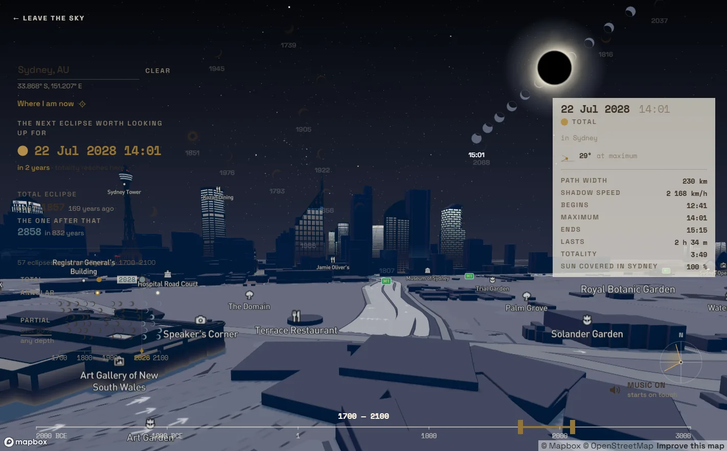
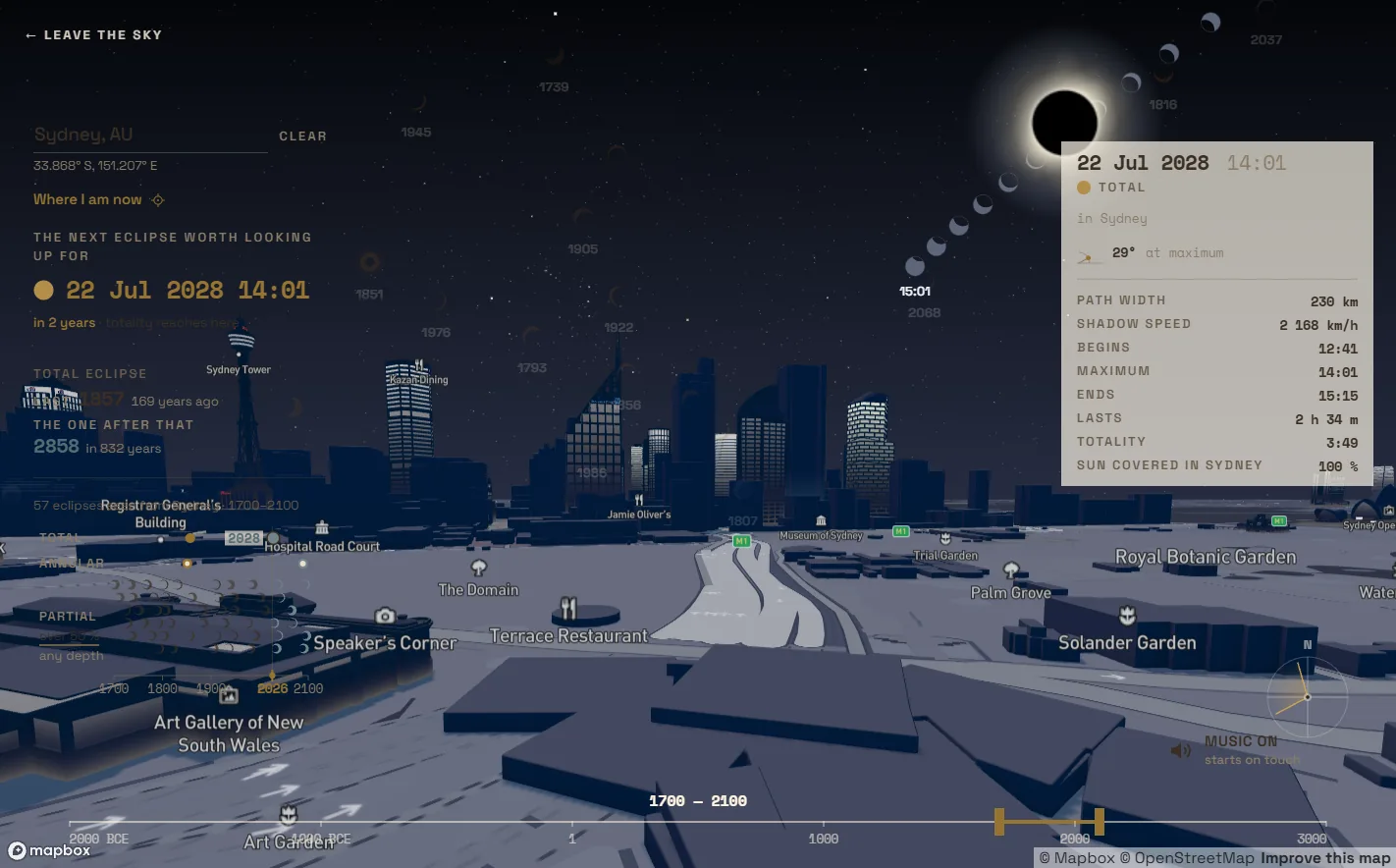
Now, if you hold the cursor on an eclipse in a city’s sky, it prints itself as that kind of composite photograph: a chain of Suns along the real path the Sun travelled across that sky, from a thin crescent through a black disc and back to a crescent.
The first version printed four Suns on a phone and read as four markers rather than as one flight. The cause turned out to lie in the time labels, which are twice as wide as the disc, and not in the discs. The text cannot be made smaller, so the labels were removed, and there were ten exposures instead of four.
That brought yet another round of rework. But it all came together. And now I am as happy with it as I could be.
What I would like to stay from all this
Twelve approaches to one screen, and the winner named by none of the research. The shadow in the intro that was not there, then a shadow, then its trail. A pattern that exists only because opacity was already taken by age. A separate page that came out of wanting to touch an image. An interface that became clear after three buttons were taken out of it.
None of these decisions was thought up in advance. Each appeared in response to a problem, and almost every one is better than the one I had planned.
So if you are making something and you have hit a wall: don’t abandon that spot. Pick at it a bit more. That is usually where the nicer answer is lying.
Where the Shadow Fell lives at eclipses.bogachev.fr. Data: NASA Five Millennium Canon of Solar Eclipses (Espenak & Meeus), GeoNames, the HYG star catalogue, the SILSO sunspot series, OpenStreetMap, Mapbox. Open for commissions and for exhibitions.